

Make Them Save: 30+ Instagram Carousel Ideas by Goal and an AI Workflow
The carousel formats that consistently drive saves and shares are step-by-step tutorials, checklists, myth-vs-fact breakdowns, before/after reveals, and UGC compilations. Each one works because it gives the swiper a reason to stop, absorb, and return later. Slide 1 has to hook fast, and the last slide needs a save, share, or comment prompt — for practical advice on crafting these elements, see our visual storytelling tips to boost your brand’s impact. Pick one format from the idea bank below and produce it this week.
TL;DR:
- Carousel formats like tutorials, checklists, and myth-vs-fact are most effective when they solve specific viewer problems, leading to higher saves and shares.
- Using 6 to 10 slides, these formats build authority, utility, trust, social proof, or proof of results, depending on the goal.
- Designing for mobile, maintaining one idea per slide, and including interactive elements like videos or polls boost engagement.
- Automating carousel creation with AI tools can save up to eight hours weekly, provided the content is checked for brand consistency and accuracy.
- Carousels work best for content with multiple steps, proof points, or checklists, while reels or single posts suit emotional, quick-react messaging.
Table of Contents
- Proven Instagram Carousel Formats and When to Use Each
- 30+ Ready-to-Copy Carousel Ideas With Slide-by-Slide Blueprints
- Design and Copy Rules That Make Carousels Swipeable
- How to Plan, Schedule, and Measure Carousel Posts
- Automating Carousel Creation With Xyla (How to and Time Savings)
- When a Carousel Beats Another Format
- Try Xyla to Turn Carousel Ideas Into Scheduled Posts
- Sources
Proven Instagram Carousel Formats and When to Use Each
Not every format earns a swipe. The ones that consistently perform share one trait: they solve a problem the viewer already has, which is exactly why checklist and tutorial-style carousels get saved for later reference instead of scrolled past.
- Step-by-step tutorial — teaches a process in sequence; works best at 7 to 10 slides so each step gets room to breathe. Hook idea: “The 5-minute fix nobody tells you about.”
- Checklist — gives readers something to act on immediately; 5 to 7 slides keeps it skimmable. Hook idea: “Steal this pre-launch checklist.”
- Myth vs. fact — corrects a common misconception; 6 to 8 slides, alternating myth then fact per pair. Hook idea: “You’ve been doing this wrong.”
- Before/after — shows transformation with proof; 4 to 6 slides work since the payoff is visual, not verbal. Hook idea: “Same product, 30 days apart.”
- UGC compilation — stitches customer photos or reviews into a single narrative; 6 to 9 slides depending on how many voices you feature. Hook idea: “We didn’t write this. Our customers did.”
Each format has a different job. Tutorials build authority, checklists build utility, myth-vs-fact builds trust, before/after builds proof, and UGC builds social validation. Mixing all five across a month keeps your feed from feeling like a lecture.
30+ Ready-to-Copy Carousel Ideas With Slide-by-Slide Blueprints
Organizing ideas by the job they perform, rather than by topic, is what makes a swipe file genuinely useful instead of a random grab bag. Here’s a working bank you can adapt this week.
Teach
- “5 mistakes killing your [skill]” — Slide 1: bold mistake #1 as the hook. Slides 2 to 5: one mistake plus fix per slide. Slide 6: “Save this before your next attempt.”
- “How to [process] in under 10 minutes” — Slide 1: time-bound promise. Slides 2 to 7: numbered steps with one visual each. Slide 8: recap grid.
- “The anatomy of a [thing that works]” — Slide 1: labeled diagram teaser. Slides 2 to 6: breakdown by component. Slide 7: “Which part surprised you?”
- “Beginner vs. pro [technique]” — Slide 1: side-by-side teaser. Slides 2 to 5: comparison pairs. Slide 6: CTA to try the pro version.
Convert
- “Why [product] outsells the alternative” — Slide 1: provocative comparison. Slides 2 to 5: feature-by-feature case. Slide 6: shop link CTA.
- “3 signs you need [product category]” — Slide 1: relatable pain point. Slides 2 to 4: symptom slides. Slide 5: solution reveal with link.
- “What’s inside our bestseller” — Slide 1: product teaser. Slides 2 to 6: ingredient or feature callouts. Slide 7: “Tap the link to grab yours.”
- “Price breakdown: what you’re actually paying for” — Slide 1: sticker shock hook. Slides 2 to 5: cost justification. Slide 6: purchase CTA.
Entertain
- “Rating [related items] from worst to best” — Slide 1: tier list teaser. Slides 2 to 6: ranked entries. Slide 7: “Fight me in the comments.”
- “Things only [niche audience] understands” — Slide 1: relatable inside joke. Slides 2 to 6: examples. Slide 7: tag a friend prompt.
- “A day in the life of [role]” — Slide 1: time stamp hook. Slides 2 to 7: hourly snapshots. Slide 8: “Which hour is you?”
Prove
- “Real results from real customers” — Slide 1: outcome number. Slides 2 to 5: individual proof points. Slide 6: “Read more reviews” link.
- “We tested it so you don’t have to” — Slide 1: test premise. Slides 2 to 5: findings. Slide 6: verdict slide.
- “The data behind [claim]” — Slide 1: surprising stat. Slides 2 to 4: supporting context. Slide 5: source citation slide.
Recap
- “This month’s top 5 [content type]” — Slide 1: countdown teaser. Slides 2 to 6: ranked recap. Slide 7: “Save for later.”
- “What you missed this week” — Slide 1: FOMO hook. Slides 2 to 5: highlight reel. Slide 6: follow prompt.
For e-commerce accounts specifically, product carousel Instagram formats like “new arrival lookbooks” or “how it’s made” behind-the-scenes sequences convert well because they double as store growth content without feeling like an ad.
Design and Copy Rules That Make Carousels Swipeable
Carousels reward deliberate slide design because every swipe, save, and comment counts as a separate interaction, and algorithms notice when a post holds attention across multiple slides instead of one glance.
- Design for mobile first: minimum 24pt text, high contrast, nothing critical within 10% of the edges.
- One idea per slide. If you need “and” to describe a slide’s content, split it into two.
- Build a staircase: each slide should raise a small question the next slide answers.
- Save the punchiest visual for the hook slide, not slide 3.
- Mix in one short video slide occasionally. Alternating image and video can lift completion rates without overwhelming the swipe.
Micro-copy templates: Hook: “The one thing nobody tells you about [topic].” Mid-slide: “Here’s why that matters: [one sentence].” Closing CTA: “Save this so you don’t forget. Tap the link to shop.”
Pro Tip: Design your second-to-last slide as a tiny interaction, a poll question, an emoji vote, a “guess the answer” tease. It buys extra seconds on the post and nudges the save before the swipe ends.
How to Plan, Schedule, and Measure Carousel Posts
A repeatable framework beats reinventing your content calendar every week.
- Pick the goal first: awareness, conversion, or trust, then choose the audience segment it serves.
- Match format to goal: teach for awareness, convert for sales, prove for trust, and always end with one clear CTA.
- Post carousels multiple times each week, repurposing top performers into Stories, Pinterest pins, or a blog recap for extra mileage.
- Track swipe-through rate, saves, shares, and profile visits weekly, then A/B test hook wording or slide count on your next post.
Automating Carousel Creation With Xyla (How to and Time Savings)
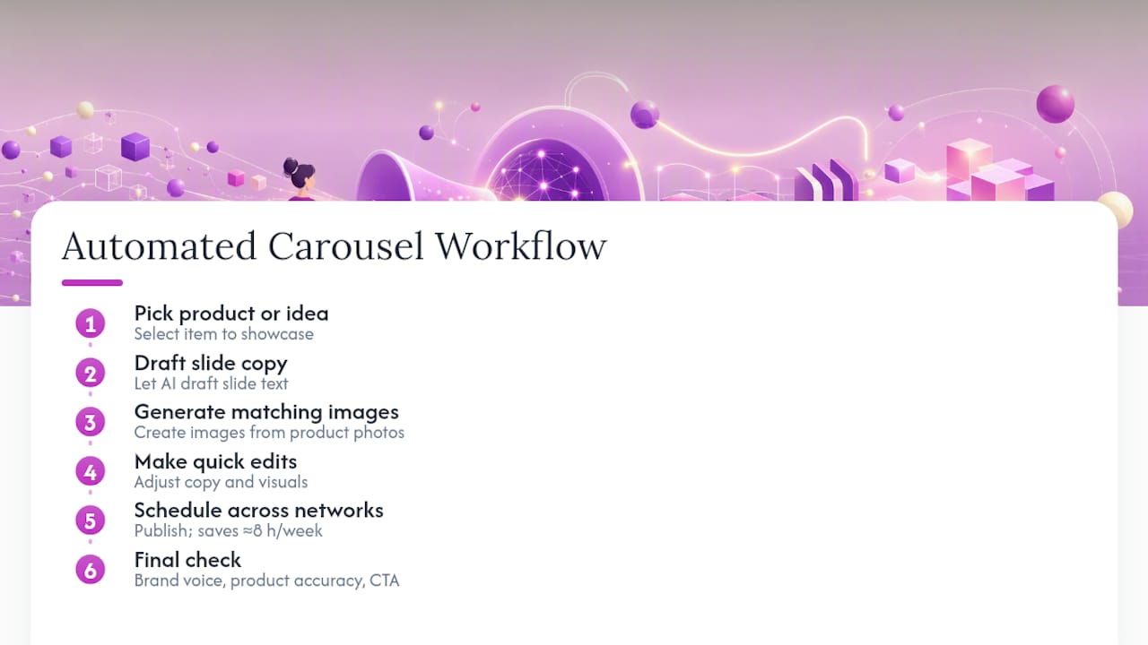
A typical automated workflow looks like this: pick a product or idea, let AI draft the slide copy, generate matching images from your product photos, make quick edits, then schedule across networks. Creators using automated content workflows report meaningful weekly time savings, and Xyla’s own data points to roughly eight hours saved per week for store owners who’d otherwise build every slide manually. Still check brand voice, product accuracy, and the CTA before publishing. Automation speeds production, not judgment.
When a Carousel Beats Another Format
Carousels win when the idea has steps, proof, or a checklist. A single image or reel wins when the message is one emotional beat, a launch moment, a quick reaction, a trending audio hook. My rule: if you’d need more than one sentence to explain the point, it’s a carousel. Balance your calendar so carousels teach and prove, while reels and single posts entertain and announce.
— Toby
Try Xyla to Turn Carousel Ideas Into Scheduled Posts
Building 30 carousel ideas is one thing. Turning each one into on-brand slides without spending your Sunday in a design tool is another. Xyla AI generates slide copy and visuals straight from your product listings, applies templates that keep every carousel consistent with your brand, and schedules the finished post across Instagram, TikTok, and Facebook automatically.
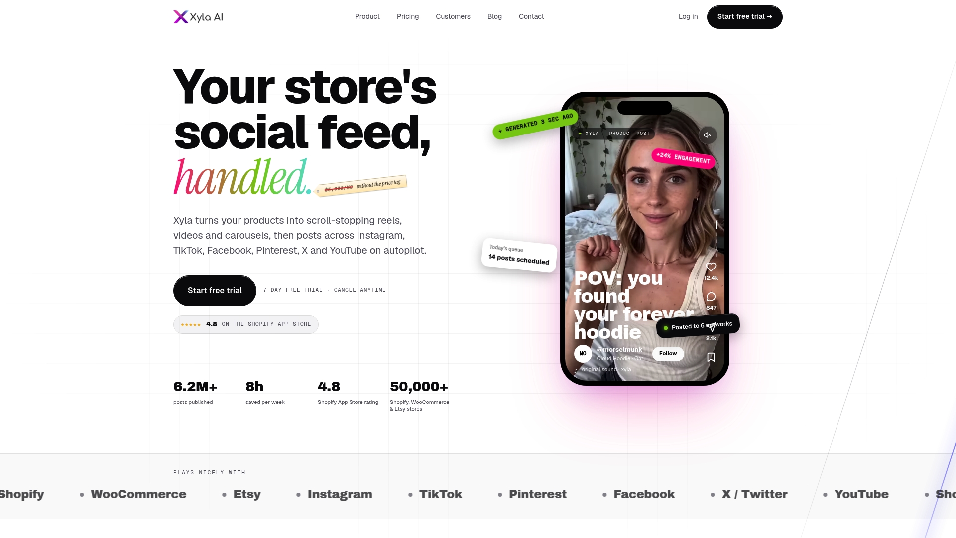
A typical workflow: drop in a product, choose a carousel format like “how it’s made” or “customer favorites,” let Xyla draft the copy and images, then approve and schedule for the week ahead. If you want to see the full setup, the step-by-step automation guide walks through it start to finish. Start a trial and get your first automated carousel scheduled before the week is out.
Sources
- Instagram Carousel Post Ideas for Business: 20 Ideas — Aslan Agency
- Instagram carousel: what to post and why it works — Sprout Social
- 80 Instagram carousel ideas with examples that get saved — Socialmon


