

Ecommerce CTA Examples for Store Owners That Need No Design Work

Start with “Add to Cart” as your baseline, then run two tests against it: a first-person variant like “Add to My Cart” and a sticky mobile bar that keeps the button visible on scroll. Pair every primary button with “Buy Now” for shoppers who want to skip the cart, use “Proceed to Checkout” or “Place Order” at the payment stage, and reserve urgency phrasing for genuine promos. Keep price, star rating, and the button in the same eyeline, and repeat that button as a sticky element once the page scrolls past it.
TL;DR:
- Testing first-person copy like “Add to My Cart” can improve early engagement, but only about half of those tests outperform the standard “Add to Cart.”
- Sticky or floating CTA bars on long product pages significantly increase mobile conversions by keeping the action accessible during scrolling.
- Urgency phrases such as “Only 3 Left” are effective only when backed by real inventory data; false scarcity damages trust over time.
- Prioritize quick, high-traffic page tests like button color contrast and placement, as they generate faster, more reliable results.
- Using social content automation tools can accelerate traffic to CTA variations, helping gather enough data for confident optimization.
Table of Contents
- Ecommerce CTA Examples for Every Stage of the Funnel
- Why These CTAs Work: The Psychology Behind the Copy
- Design and Placement Rules That Make CTA Copy Actually Work
- Which A/B Tests to Run First, and What to Measure
- Mobile CTA Patterns Worth Testing First
- Trust Cues and Microcopy That Remove Last-Second Doubt
- A Step-by-Step Checklist for Rolling Out CTA Tests
- Accessibility Rules for CTA Buttons Nobody Should Skip
- Connecting CTAs to Personalized Recommendations
- CTAs for Repeat Purchases and Subscriptions
- What Actually Moves the Needle After Hundreds of CTA Tests
- Let Xyla AI Keep Your CTA-Driven Promotions Fed With Fresh Creative
- Sources
- FAQ
Ecommerce CTA Examples for Every Stage of the Funnel
Every ecommerce page has a job to do, and the button copy should match that job. A product page CTA is not doing the same work as a cart CTA, and treating them identically is one of the more common mistakes store owners make when they copy generic marketing advice onto a shopping site.
Product page primary CTAs
These sit above the fold, next to price and variant selectors. Nielsen Norman Group’s product page research recommends a clearly labeled add-to-cart mechanism on every product page, with quantity defaulted to one and the buy action never ambiguous.
- “Add to Cart” — the control. Do not replace it without testing.
- “Add to My Cart” — first-person variant worth testing against the control.
- “Buy Now” — for shoppers who want express checkout, skipping the cart entirely.
- “Get Yours Today” — benefit-forward, works well for apparel and lifestyle goods.
- “Claim This Deal” — reserve for genuine limited-time pricing, not everyday stock.
- “Reserve Mine” — useful for pre-orders or limited drops.
- “Add to Bag” — a softer variant some fashion brands use instead of “cart.”
- “Ship It to Me” — works for straightforward, low-consideration purchases.
Secondary product CTAs
Secondary actions should never compete visually with the primary button. Keep them as text links or outline buttons.
- “Save for Later” or “Add to Wishlist” — for shoppers not ready to buy.
- “Compare” — useful on pages with multiple sizes, materials, or models.
- “Ask a Question” — reduces pre-purchase hesitation on higher-priced items.
- “Notify Me When Back in Stock” — captures demand instead of losing the visitor.
Collection and quick-add CTAs
Collection pages need lighter-weight actions since shoppers are still browsing.
- “Shop the Collection” — standard entry point from homepage banners.
- “Quick Add” — lets shoppers add without leaving the grid view, which speeds up browsing sessions considerably.
- “View Details” — for products needing more context before a decision.
Cart and checkout CTAs
This is where clarity beats cleverness every time. NN/g’s checkout guidance recommends explicit wording, such as naming the dollar amount, and removing distractions during this stage.
- “Proceed to Checkout” — the standard, expected label.
- “Continue to Payment” — useful for multi-step checkouts.
- “Complete My Order” — reinforces ownership at the final step.
- “Pay $48.00” — states the exact amount, which reduces surprise at the last screen.
- “Place Order” — direct, unambiguous, and platform-standard for a reason.
Promo, urgency, and email CTAs
- “Get 20% Off My First Order” — pairs a discount with first-person framing.
- “Shop the Sale” — simple, works for sitewide promotions.
- “Only 3 Left, Grab It” — legitimate scarcity when inventory counts are real.
- “Get the Email-Only Discount” — for newsletter capture forms.
- “Subscribe for Early Access” — frames the signup as a benefit, not a form fill.
Why These CTAs Work: The Psychology Behind the Copy
Button copy is not decoration. It is a micro-decision point, and the words you choose either reduce friction or add it. First-person phrasing like “Add to My Cart” can trigger a subtle sense of ownership before the purchase even happens, according to RevenueFlows’ analysis of Shopify product pages. That ownership framing does not always win, though.
The first-person “Add to My Cart” beats the standard “Add to Cart” in roughly half of tested scenarios, and loses in the other half. Treat it as a hypothesis worth testing, never as an automatic upgrade.
The gap between a vague label and an outcome-oriented one comes down to specificity. “Submit” tells the shopper nothing. “Get My Discount” or “Complete My Order” tells them exactly what happens next, which matches Baymard’s core button-design principle that a button should clearly communicate the result of clicking it.
Urgency is the trickiest lever in the whole toolkit. “Only 3 Left” works when it is true and backed by real inventory data. The same phrase on a product that restocks every week trains shoppers to distrust every scarcity claim on your site afterward, including the honest ones. Save urgency language for real flash sales, genuine low-stock situations, and time-boxed promo codes.
Copy changes are also some of the cheapest tests you can run. Swapping “Add to Cart” for a benefit-led variant or testing a first-person pronoun requires no design work, and reported lifts from these changes range widely depending on your traffic, price point, and audience. That variability is exactly why testing beats guessing here. A rule of thumb: action verb plus explicit outcome outperforms a vague label almost every time, whether the outcome is “my cart,” “my discount,” or “my order.”
Design and Placement Rules That Make CTA Copy Actually Work
Great copy on a button nobody notices does nothing. Placement and contrast decide whether the words even get read.
- Make the CTA the highest-contrast element on the page. Baymard’s button design research is blunt about this: your primary action button should stand out more than any other visual element, including promotional banners.
- Keep price, star rating, and the button in one eyeline. Shoppers should not have to scroll or hunt to connect the price to the purchase decision.
- Choose one loud primary action per screen. If “Add to Cart” and “Buy Now” both fight for attention with equal visual weight, neither wins clearly. Make one solid and prominent, the other outlined and secondary.
- Avoid ghost or outline buttons for the primary action. Solid, filled buttons consistently outperform outline styles in Baymard’s comparisons because they read as more clickable at a glance.
- Add a sticky CTA bar on long product pages. Once a shopper scrolls past the original button, a persistent bar at the bottom of the screen keeps the action available without forcing them back up.
- Keep tappable areas generous on mobile. A button that is easy to read but hard to tap accurately costs you conversions on the exact device where most of your traffic probably lives.
- Keep button copy short. Two to three words is the sweet spot recommended by RevenueFlows’ product page rules — long labels wrap awkwardly and slow comprehension.
Pro Tip: Check your primary CTA color against every other colored element on the page, including sale badges and navigation highlights. If your button shares a color family with your “Sale” tag, shoppers’ eyes will bounce between them instead of landing on the action you want.
Which A/B Tests to Run First, and What to Measure
Not every test deserves equal priority. Start with the changes that touch the most traffic and require the least engineering effort.
- Add to Cart vs. Buy Now as the default primary action on product pages. CustomFit.ai’s testing guidance flags this as a foundational test because the two buttons serve different shopper intents.
- First-person vs. baseline copy (“Add to My Cart” vs. “Add to Cart”) on your highest-traffic product templates.
- Sticky vs. static CTA placement, particularly on pages with long descriptions or image galleries that push the button off screen.
- Color contrast variants, testing your current button color against a higher-contrast alternative.
Every test needs a written hypothesis, a single primary metric, a fixed duration, and a rough sample-size target before you launch it. CTA tests reach statistical significance faster than most experiments because the button appears on every single product view, which means you are not waiting on rare events to accumulate data.
Track add-to-cart rate and checkout-start rate as your leading indicators, but revenue per visitor (RPV) is your guardrail metric. If clicks go up but RPV stays flat or drops, something downstream broke. That pattern usually means the winning variant pulled in lower-intent clicks, dragged down average order value, or increased returns. Investigate the funnel steps after the click before declaring a winner.
Mobile CTA Patterns Worth Testing First
Mobile shoppers tap through pages differently than desktop visitors, and their patience for hunting down a hidden button is close to zero. A floating or sticky Add to Cart bar that stays fixed to the bottom of the screen removes the need to scroll back up, and it is one of the more reliable mobile-specific wins according to CustomFit.ai’s testing data.

Search boxes need their submit button positioned directly adjacent to the input field, never floating elsewhere on the screen. Filter menus on collection pages should carry a sticky “Apply” button so shoppers do not have to scroll past their selected filters to confirm them.
Resist the temptation to stack multiple prominent buttons on a small screen. A product page with “Add to Cart,” “Buy Now,” and “Add to Wishlist” all rendered at equal size and weight forces the shopper to slow down and choose, which is friction you do not want at the exact moment they were ready to act. Give one action visual dominance and let the rest recede. Test floating versus inline placement on your highest-traffic mobile templates first, since that is where a small lift compounds fastest.
Trust Cues and Microcopy That Remove Last-Second Doubt
The line of text sitting near your CTA button often does as much work as the button itself. Shoppers hesitate at the final step for practical reasons: will this ship on time, can I return it, is my card information safe. Answer those questions in one honest line rather than making shoppers dig through a FAQ page.
Place shipping promises, return policies, and security assurances above or below the button, never crammed inside it. “Free returns within 30 days” under an Add to Cart button removes one objection instantly. “Ships in 2 business days” does the same for delivery anxiety. Baymard’s research also points to a subtler use of microcopy: clarifying what happens after the click, such as “You’ll review your order on the next page” before a checkout button, which lowers hesitation for shoppers who fear committing too early.

Trust badges (secure checkout icons, payment logos) belong near the CTA but should never outsize it. A button surrounded by five logos and three badges loses its visual authority. One clean row of payment icons below the button, kept smaller than the button itself, does the job without diluting the action you actually want taken.
A Step-by-Step Checklist for Rolling Out CTA Tests
Running CTA experiments without a process wastes traffic and produces results nobody trusts. Follow this sequence for every test you launch.
- Define your primary metric before writing any copy. Decide whether you are optimizing for add-to-cart rate, checkout-start rate, or RPV, and commit to it before seeing results.
- Pick your highest-traffic page first. Your bestselling product or your top landing page will reach significance fastest and matters most to revenue.
- Write a specific hypothesis. “Changing to first-person copy will increase add-to-cart rate because it increases perceived ownership” is testable. “Let’s try something new” is not.
- Build the variant and set a timebox. Decide your test duration and rough sample size target before launch, not after you see early results trending your way.
- Watch for red flags mid-test. A click lift with flat or falling RPV, a mobile-specific regression, or urgency language that starts generating complaints are all reasons to pause and dig deeper.
- Ship the winner and plan the next test. A finished experiment is not the end of the road. Queue up the next hypothesis before you lose momentum.
Pro Tip: Log every test result in one running document, win or lose. A “loss” that shows first-person copy underperformed on your store is still useful data. It stops you from re-running the same test on a different page six months from now.
Accessibility Rules for CTA Buttons Nobody Should Skip
An inaccessible CTA button is a lost sale, not just a compliance gap. Screen reader users need buttons labeled with clear, descriptive text through ARIA attributes, especially when the visible label is short, like an icon-only cart button. A button labeled only with a shopping bag icon needs aria-label="Add to cart" or similar so assistive technology can announce its function.
Every CTA must be reachable and operable using a keyboard alone, with a visible focus state that shows which element is currently selected. If a shopper tabs through your checkout flow and the “Place Order” button gives no visual indication it is focused, you have created a dead end for anyone who cannot use a mouse or touchscreen.
Color contrast has to meet WCAG guidelines, which generally call for a contrast ratio of at least 4.5:1 for standard text against its background. A pastel button with light gray text might look on-brand, but it fails both accessibility standards and basic visibility for shoppers with low vision. Button size matters too: touch targets should be large enough to tap accurately, which overlaps directly with the mobile usability rules covered earlier. Accessible design and high-converting design point in the same direction more often than store owners expect.
Connecting CTAs to Personalized Recommendations
A CTA sitting next to a generic “related products” carousel works differently than one sitting next to a recommendation genuinely tailored to that shopper’s browsing history. When a product recommendation block says “Because you viewed [Product Name],” the CTA next to it can afford to be more direct, something like “Add This Too” or “Complete the Look,” because the context already did the persuading.
Dynamic content changes based on cart contents deserves its own CTA treatment. A shopper who has a jacket in their cart and sees a recommended scarf might respond better to “Add the Matching Scarf” than a generic “Add to Cart.” The specificity ties the action to a reason.
Be careful with real-time personalization and urgency together. A dynamically generated “Only 2 left in your size” claim needs to reflect actual, live inventory data. If your personalization engine shows stock counts that do not match reality, you erode the exact trust that made the recommendation persuasive in the first place. Keep personalized CTAs benefit-specific rather than pressure-specific, and let the relevance of the recommendation do the persuading instead of manufactured scarcity.
CTAs for Repeat Purchases and Subscriptions
Post-purchase and subscription CTAs work on a different psychological register than first-time purchase buttons. The shopper already trusts you, so the CTA can lean on convenience and familiarity instead of persuasion.
“Buy Again” is the standard for repeat-purchase prompts, usually surfaced in order history or a post-purchase email. It works because it removes the browsing step entirely. “Subscribe & Save” pairs a clear financial incentive with a recurring commitment, and it consistently outperforms a plain “Subscribe” button because it states the benefit inside the label itself. “Reorder My Usual” is a stronger variant for consumables like coffee, supplements, or pet food, where the shopper has an established habit.
For subscription upgrades or plan changes, specificity still wins: “Switch to Monthly Delivery” beats “Update Subscription” because it tells the shopper exactly what changes. Post-purchase upsell CTAs, like “Add to My Next Order,” should always clarify timing so shoppers do not mistake it for an immediate charge. The common thread across all of these: the more precisely the button describes the actual outcome, the less the shopper has to think before clicking it.
What Actually Moves the Needle After Hundreds of CTA Tests
Clarity beats cleverness almost every time. The catchiest button copy rarely outperforms the plainest one that tells shoppers exactly what will happen when they click it, and store owners who chase clever phrasing over clear phrasing usually end up reverting to the boring version anyway.
Never swap a default CTA on gut feeling alone, even when the new version tested well somewhere else. Prioritize tests that touch checkout-start rate and RPV over anything that only moves top-of-funnel clicks. And if most of your traffic is mobile, which it probably is, fix sticky CTA placement before you spend another week debating button color.
— Toby
Let Xyla AI Keep Your CTA-Driven Promotions Fed With Fresh Creative
Every CTA test in this guide needs traffic and fresh creative behind it to actually produce a signal, and that is the part most store owners fall behind on. Xyla AI is built specifically for Shopify, WooCommerce, and Etsy sellers who need a steady stream of social content to drive shoppers toward those buttons without burning a week on video edits every time a new promo launches.
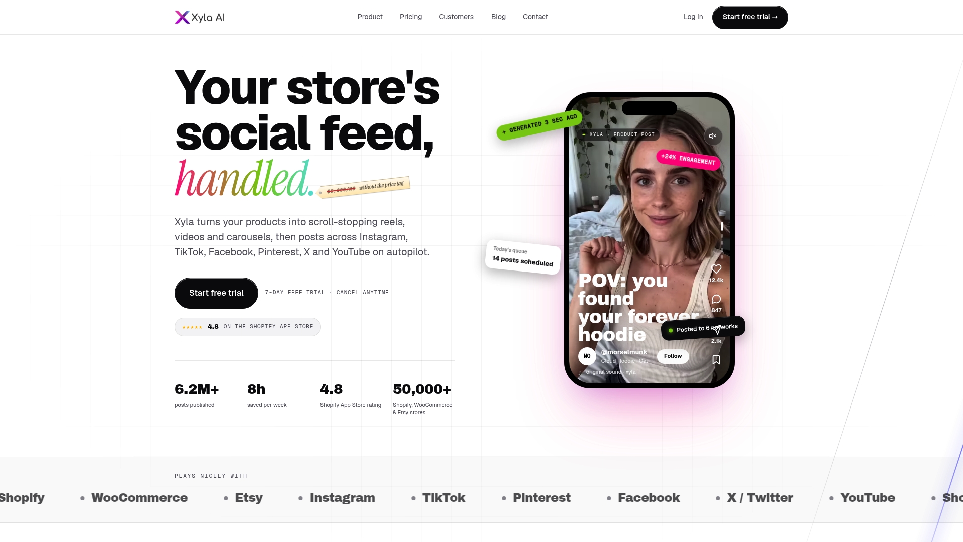
Instead of remixing templates, Xyla AI turns your actual product listings into new video and image content, including reels and carousels built to match whatever urgency or discount CTA you are testing that week. It schedules and publishes that content automatically across Instagram, TikTok, and Facebook, which means your “Get 20% Off My First Order” promo or your new “Shop the Sale” collection page gets social traffic pointed at it the same day, not whenever someone on your team finds an hour to post. That speed matters directly for CTA testing: the faster you can drive fresh traffic to a variant, the faster you reach a reliable sample size. Store owners running on the Growth plan, starting at $29 a month, get AI content generation built into the plan rather than billed per generation. If your store runs on Shopify, the Shopify-specific plans connect directly to your catalog so new products flow straight into social content without manual uploads. Check current plans and start a trial to see how much faster your next CTA promo gets in front of real shoppers.
Sources
For deeper technical guidance, Baymard’s button design research and Nielsen Norman Group’s ecommerce checkout report remain the most rigorous usability sources available. For copy-specific testing frameworks, CustomFit.ai’s A/B testing guide and Babylove Growth’s CTA strategy overview offer practical starting points for building your own test roadmap.
- Button Design: Best Practices for Optimal UI Buttons – Baymard
- Nielsen Norman Group – E-commerce report: Product Pages (excerpts)
- 75+ Shopify CTA Button Text Ideas That Drive Clicks (2026) — EasyAppsEcom
- Shopify product page call to action: 6 rules | RevenueFlows Blog
FAQ
What Is the Best CTA for a Product Page?
“Add to Cart” remains the reliable baseline because it sets clear shopper expectations, according to Baymard’s button research. Test a first-person variant like “Add to My Cart” against it before switching your default, since it wins only about half the time.
Should I Use “Buy Now” or “Add to Cart”?
Both, ideally as separate buttons serving different intents. “Add to Cart” suits shoppers who might buy more than one item, while “Buy Now” serves shoppers ready for express checkout, a distinction CustomFit.ai’s testing guidance recommends testing directly against each other.
How Do I Know if a CTA Test Actually Worked?
Check revenue per visitor, not just click-through rate, since a click increase without a matching RPV increase usually signals a problem elsewhere in the funnel. Give the test a fixed duration and a defined sample-size target before you start, and resist calling a winner early.
Does Urgency Language Actually Increase Conversions?
Genuine urgency, like a real low-stock count or a time-boxed discount, can reduce hesitation, but fabricated scarcity damages trust once shoppers notice the pattern. Reserve phrases like “Only 3 Left” for situations backed by actual inventory data.
What’s the Fastest Way to Get More Traffic to a New CTA Test?
Driving traffic through fresh social content is one of the quickest ways to feed a live test, since organic reach on outdated posts tends to plateau fast. Tools like Xyla AI automate that content creation and posting across Instagram, TikTok, and Facebook, which shortens the time between launching a CTA variant and reaching a usable sample size.


