

6 Step Playbook to Produce Quote Cards for Ecommerce Brands
Quote cards turn a single line of brand-aligned text into a shareable graphic that builds recall, softens a sales feed, and gives followers something worth reposting. The fastest path to good ones is a locked brand kit template you batch-export into every size you need, or a premade set you customize enough to feel like yours. Either way, start with the layout, not the quote.
TL;DR:
- Lock a consistent brand kit with fixed logo placement, limited colors, and specific typography to ensure quote cards look uniform and recognizable across all formats.
- Design templates with three layout styles—centered text, quote-plus-author, and image-backed—to quickly swap quotes without rebuilding from scratch.
- Batch-export all designated sizes—square, story, open graph, and print—from one template to maintain efficiency and prevent layout mistakes.
- Use original or public-domain quotes to avoid copyright issues, and ensure quotes align with audience segments’ emotional needs and channel-specific tones.
- Apply strong contrast, simple fonts, and short text to enhance accessibility, while avoiding clutter from excessive branding elements that compete with the quote.
Table of Contents
- How Brands Use Quote Cards for Marketing Materials
- Design Rules That Keep Quote Cards Consistent With Your Brand Kit
- What Sizes and Export Specs Work Best for Social and Print?
- How to Produce Branded Quote Cards in 6 Steps
- Where to Source Quotes Without Copyright Headaches
- Ready-to-Use Short Branding Quotes and 3-Word Prompts
- Tips for Customizing Templates to Match Your Brand Voice
- How to Choose Quotes That Match Your Audience Segments
- Adding Logos and Brand Elements Without Cluttering the Design
- Making Quote Cards Accessible to a Diverse Audience
- Author Perspective: Why Quote Cards Still Earn Their Place
- Automate Brand-Consistent Quote Cards With Xyla AI
- Sources
- FAQ
How Brands Use Quote Cards for Marketing Materials
Quote cards for brands earn their spot in a content calendar because they do double duty: they look native to social feeds while carrying a message that would feel stiff as plain text. A well-placed card slows the scroll without demanding a purchase decision, which is exactly why they perform well between product posts.
The strongest use cases include:
- Feed and Story posts that break up product photography with something more human and shareable.
- Email headers and newsletter dividers where a short line sets the tone before the sales content starts.
- Packaging inserts and in-store signage that reinforce brand voice at the point of purchase.
- Community prompts that ask followers to share their own version, turning a static graphic into a light UGC campaign.
Used consistently, quote cards build the kind of visual shorthand that makes a brand recognizable even with the logo cropped out.
Design Rules That Keep Quote Cards Consistent With Your Brand Kit
A quote card only works as a brand asset if it looks like it came from the same shop as everything else you publish. That means locking a few decisions once, then reusing them every time, rather than redesigning from scratch for each new line of text.
Start with a brand kit checklist:
- Logo placement and sizing — pick one corner or footer treatment and stick with it across every card.
- Color tokens — limit yourself to two or three brand colors for backgrounds and text, not the full palette.
- Typography — one display font for the quote, one utility font for attribution or captions.
- Spacing rules — set fixed margins so text never touches the edge, even on the smallest export size.
- Layer organization — keep quote text, background, and logo on separate layers in your template so swapping a line of copy takes seconds, not a rebuild.
Readability constraints matter as much as color choice. Design practitioners generally recommend keeping quote text under roughly 20 words so it reads clearly at thumbnail size, with strong contrast between text and background and a single typographic hierarchy per card, according to practitioner guidance on branding quotes for business. Skip drop shadows and gradients behind text; they cost you contrast exactly where you need it most.
For layout patterns, rotate between three options rather than inventing a new look each week: centered typographic cards for pure text, quote-plus-author cards when the source adds credibility, and image-backed cards when you want a product photo doing double duty as background.
Pro Tip: Build one master template with all three layout patterns saved as variants in the same file. Swapping quotes becomes a five-minute task instead of a design session.
What Sizes and Export Specs Work Best for Social and Print?
One design file should generate every format you need without redoing the layout each time. The trick is designing to the tightest safe zone first, since a square Feed post has more forgiving margins than a Story or an Open Graph preview crop.
Useful presets to keep on hand:
- Square (1080x1080px) for feed posts and general sharing.
- Story/Reel (1080x1920px) with text kept in the middle third to avoid UI overlap.
- Open Graph (1200x630px) for link previews on blog posts and email.
- Print card (business-card or postcard size) for packaging inserts, using CMYK color mode instead of RGB to avoid muddy printed color.
Export web versions as PNG for crisp text and JPEG for photo-heavy backgrounds; export print files as PDF with embedded fonts. Checking your work against social media size and safe-zone guidance before publishing catches cropping issues before followers do. The efficient version of this workflow renders one source file into every export size in a single batch operation rather than resizing each format by hand.
How to Produce Branded Quote Cards in 6 Steps
- Pick or write the quote. Favor lines under 20 words that echo something your brand already says in captions or product copy.
- Drop it into your locked template. Apply the brand kit, choose centered, quote-plus-author, or image-backed layout based on the message.
- Check legibility at thumbnail size. Shrink the preview to phone-scroll size before you approve anything; text that reads fine full-screen often disappears at thumbnail scale.
- Batch-export every preset. Generate square, Story, Open Graph, and print sizes from the same file in one pass.
- Schedule with a caption strategy. Pair each card with a caption that adds context rather than repeating the quote verbatim, and plan to reuse strong performers across email and packaging.
- Measure engagement and iterate. Track saves and shares specifically, since quote cards tend to outperform product posts on both metrics, then feed that back into your next batch of quotes.
Pro Tip: Save your top three performing quote cards each month in a swipe file. Recurring themes tell you which brand messages actually land with your audience.
Where to Source Quotes Without Copyright Headaches
Original lines pulled from your own founder, leadership team, or customer reviews carry zero permission risk and often perform better because they sound specifically like you. Public-domain quotes from historical figures are generally safe to use freely, but recent quotes from living authors, executives, or celebrities can require permission or at least clear attribution before commercial use, a distinction VistaPrint’s branding quotes guide calls out directly.
A few practical rules:
- Write originals when possible — they’re the safest and most on-brand option.
- Use public-domain quotes freely, but still attribute the speaker for credibility.
- Get permission for quotes from living, named individuals before using them in ads or paid promotion.
- Paraphrase carefully — changing wording doesn’t remove attribution obligations if the idea and phrasing are still recognizably someone else’s.
Ready-to-Use Short Branding Quotes and 3-Word Prompts
Short, thematically grouped quotes work well as starting points, especially when you need to fill a content calendar fast. Collections like Ramotion’s branding quotes roundup and Phable’s list of branding quotes group lines by theme, which makes it easier to match tone to campaign.
Inspirational:
- “Consistency builds trust.”
- “Small details, big loyalty.”
- “Quality speaks quietly.”
Trustworthy:
- “We say what we mean.”
- “Transparency is the product.”
- “Promises kept, not made.”
Playful:
- “Serious about fun.”
- “We don’t do boring.”
- “Good taste, no notes.”
Mission-driven:
- “Made for the long run.”
- “Better, on purpose.”
- “Craft over shortcuts.”
For quick UGC or caption hooks, 3-word prompts work almost as well as full quotes: “Made with care,” “Built to last,” “Yours, not ours,” “Small batch, bold.” Swap in your own verbs and nouns to match your actual voice before publishing. A generic quote reads as generic no matter how well it’s designed.
Tips for Customizing Templates to Match Your Brand Voice
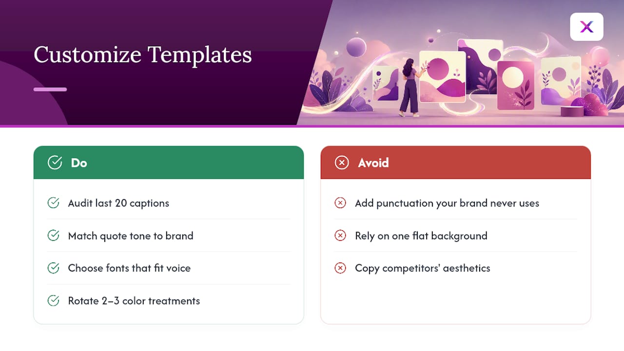
A template only becomes a brand asset once you’ve bent it toward how your brand actually talks. Start by auditing your last twenty captions and product descriptions for recurring words, sentence rhythms, and punctuation habits. A brand that never uses exclamation points shouldn’t suddenly add one to a quote card just because the template default has it.
Adjust the tone of the quote text itself, not just the visuals. A playful brand might trim quotes to punchy fragments, while a premium brand might favor fuller sentences with more white space around them. Font choice does heavier lifting here than most marketers expect: a rounded sans-serif reads friendly and approachable, while a serif or condensed sans reads more established and formal.
Color treatment is another lever. Instead of using your primary brand color as a plain background every time, try tinting it at low opacity behind a photo, or reversing it so text sits in brand color on a neutral background. Rotating two or three treatments keeps the format from feeling like a stamped-out template while staying recognizably yours.
Finally, resist copying a competitor’s quote-card aesthetic just because it performs well for them. Their audience responds to their voice. If your brand is scrappy and direct, a soft pastel template built for a wellness brand will read as inauthentic no matter how polished it looks. Match the aesthetic to the audience you actually have, not the one you’re admiring.
How to Choose Quotes That Match Your Audience Segments
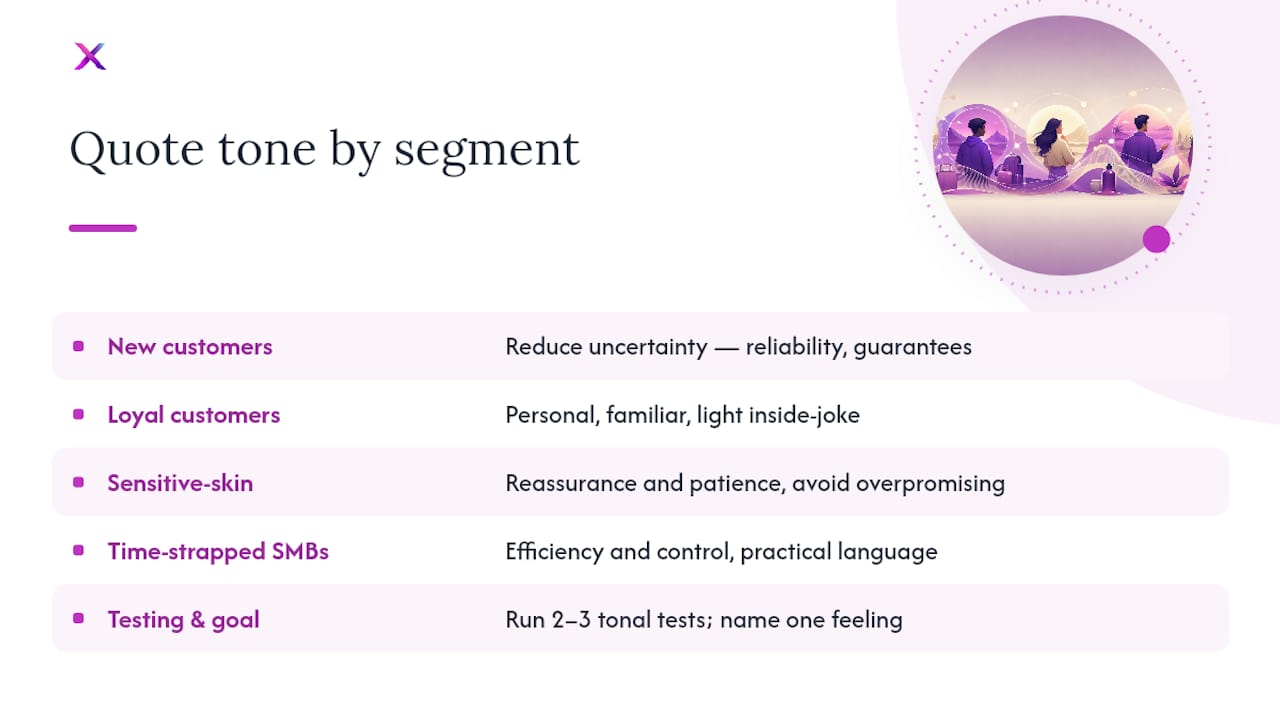
Picking a quote that sounds nice isn’t the same as picking one that lands with a specific segment of your audience. A quote aimed at new customers should reduce uncertainty, so lines about reliability, guarantees, or straightforward service tend to work better than abstract inspiration. A quote aimed at loyal repeat customers can afford to be more personal or even a little inside-joke, since that audience already trusts the brand.
Segment by the emotional job the quote needs to do. A skincare brand talking to customers dealing with sensitive skin should lean into reassurance and patience rather than bold transformation language, since overpromising erodes trust with that specific audience faster than with a general one. A B2B tool talking to time-strapped small business owners does better with quotes about efficiency and control than with abstract mission statements.
Age and channel matter too. A quote that reads as clever on a TikTok-native audience can feel try-hard on an email list of long-term customers who expect a more direct tone. Test quote themes the same way you’d test any other creative variable: run two or three tonal directions for a few weeks and track which one drives saves and shares within the specific segment you’re targeting, not just overall engagement.
The safest starting point is to write down, in one sentence, what you want a specific segment to feel after reading the card. If you can’t name that feeling clearly, the quote probably won’t land clearly either.
Adding Logos and Brand Elements Without Cluttering the Design
The biggest mistake brands make with quote cards is treating every element of the brand kit as mandatory on every card. A logo, a tagline, a color block, and a decorative icon stacked on one card competes for attention that the quote itself should be getting.
Pick one anchor element, usually the logo, and give it a fixed, small position, typically a corner or footer, at consistent size across every card. Resist the urge to enlarge it just because a specific card looks “empty” without more branding. Empty space around a logo is part of what makes it read as premium rather than promotional.
Secondary brand elements, like a tagline or a small icon, should appear only when they add meaning, not as decoration. If your brand has a specific brand mark or badge tied to reviews or certifications, save it for cards where that credibility actually matters, rather than including it by default.
Color does more branding work than people give it credit for, and it’s free of clutter risk. A consistent background color or accent bar tells a viewer which brand they’re looking at before they even register the logo, which means you can sometimes drop the logo from certain placements, like a Story slide, without losing brand recognition. Aligning colors and type choices with a defined brand voice makes this consistency easier to maintain across a team, especially once more than one person is producing content.
Making Quote Cards Accessible to a Diverse Audience
Contrast is the single biggest accessibility factor on a quote card, and it’s also the one most often sacrificed for aesthetics. Light gray text on a white background might look elegant in a design tool, but it fails for anyone with low vision and often fails outright on a phone screen in bright light. Aim for strong contrast between text and background, and test it at actual thumbnail size, not zoomed in.
Font choice affects readability more than most marketers realize. Heavily stylized script fonts might match a brand’s aesthetic, but they slow down reading for people with dyslexia and can become illegible entirely at small export sizes. Reserve decorative fonts for short accent words, never for the full quote.
Keep quote length short, both for legibility and because screen readers and translation tools handle short, direct sentences more reliably than long, clause-heavy ones. If your audience spans multiple languages or regions, avoid idioms and culturally specific references that won’t translate cleanly.
Finally, don’t rely on the image alone to carry the message. Add descriptive alt text summarizing the quote and its intent for anyone using a screen reader, and repeat the quote text in the caption rather than assuming everyone will process it visually. A quote card that only works for sighted, English-fluent, fast-scrolling viewers is excluding a meaningful share of any real audience.
Author Perspective: Why Quote Cards Still Earn Their Place
Short, repeated visual statements do more for brand memory than most marketers credit them for. The mistake isn’t using quote cards, it’s rebuilding the template every time, which introduces drift and slows output. Lock the kit, batch the exports, and the format stops feeling like a chore and starts compounding.
— Toby
Automate Brand-Consistent Quote Cards With Xyla AI
Building a quote-card system by hand works until posting slows down during a busy sales week, which is usually when consistency matters most. Xyla AI applies your locked brand kit automatically to every visual it generates, including quote-style cards, so fonts, colors, and logo placement stay fixed without anyone rebuilding a template from scratch.
This tool can pull product data to generate on-brand visuals, export them in the sizes each network needs, and auto-publish to major social platforms on a schedule set by the user. Using it can save time that would otherwise go into manual design and posting. If your current process involves hunting for templates and resizing exports by hand, automating your social media production is the faster route to the same consistency you’re already trying to build manually. Start a trial and see your product catalog turned into a week of on-brand posts before you commit to anything.
Sources
- Branding Quotes from the Experts for Inspiration | Ramotion Agency
- The 22 best branding quotes to inspire you | VistaPrint US
- The Top 50 Quotes About Branding of All Time — Phable
- Quote card royalty-free images | Shutterstock
FAQ
What Are Some Famous Quotes About Brands?
Widely cited lines include ideas like “a brand is a promise kept” and variations on trust and consistency being the foundation of brand loyalty, themes that collections like Ramotion’s roundup group by topic for easy reuse.
Where Can I Find Inspirational Business Cards With Quotes?
Stock marketplaces such as Shutterstock sell ready-made quote-card templates and images, while sellers on Amazon offer preprinted multi-packs suited to office use or gifting inserts.
What Is a Powerful 3-Word Quote?
Short phrases like “Made with care,” “Built to last,” or “Yours, not ours” work well because they fit cleanly on a card and read instantly at thumbnail size.
What Are 5 Positive Short Quotes for a Brand?
Strong options include “Consistency builds trust,” “Small details, big loyalty,” “Quality speaks quietly,” “Better, on purpose,” and “Craft over shortcuts,” all of them under ten words for easy design placement.
Do I Need Permission to Use a Quote on a Marketing Card?
Public-domain quotes from historical figures are generally safe to use with attribution, but quotes from living authors or public figures may require permission before commercial use.


